
I made another set. This time, I made masculine cards.
I colored white cardstock with Tim Holtz Distress Ink.


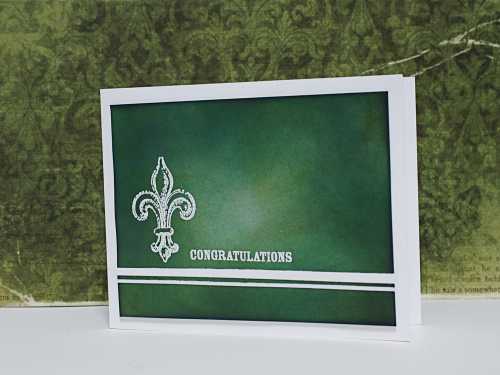

I don't like saying this but I must point out that I don't like TPC Studio Stamps. Sometimes they have very nice design, I love them! BUT the quality of their stamps!! oh... it's REALLY BAD.
I can't get clear crisp image. I normally avoid this kind of bad stamps, however I really wanted have Fleur de Lys for this card set, so... there was no choice....
I hope Hero arts make some Fleur de Lys stamp sets.
. ✰ •✰˚* ˚ ★ ˚♥♥ 。✰˚ supplies˚ ♥♥. ✰ •✰˚* ˚ ★ ˚
Thank you very much for visiting my blog.
They look fantastic !
ReplyDeleteI avoid clear stamps for the same reason, the impressions always seem to be very sub standard, give me good ole deep etched rubba any day !
Aj.
I love the shading on your cards. Great set!
ReplyDeleteI think we are so busy looking at the stunning effect you have achieved with your colour blending that we wouldnt even notice that the lines arent sharp. The colours are soooo vibrant - thanks for sharing.
ReplyDelete